

Mobile devices account for over 60% of global web traffic in 2026, making mobile web design not just an option but a fundamental requirement for any digital product. For entrepreneurs and startups building their first product, understanding how to create mobile experiences that engage users whilst maintaining accessibility and performance can determine whether your venture succeeds or fails. The challenge extends beyond simply making a website "fit" on a smaller screen-it requires rethinking navigation, interaction patterns, content hierarchy, and technical architecture from the ground up.
Mobile-first design represents a fundamental shift in how we approach web development. Rather than designing for desktop and then scaling down, this methodology starts with the most constrained environment-mobile devices-and progressively enhances the experience for larger screens.
The mobile-first approach forces designers and developers to prioritize content and functionality. When you begin with limited screen real estate, you must make difficult decisions about what truly matters to users. This constraint breeds clarity and focus.
Key benefits of mobile-first thinking:
Starting with mobile constraints naturally leads to better overall design decisions. You cannot rely on hover states, expansive navigation menus, or multi-column layouts. Instead, you must create intuitive touch interactions, streamlined content flows, and clear visual hierarchies that work universally.

Two primary methodologies dominate mobile web design: responsive and adaptive design. Understanding their differences helps you choose the right approach for your project.
Responsive design uses fluid grids, flexible images, and CSS media queries to create a single codebase that adapts seamlessly to any screen size. The layout responds dynamically to the viewport width, rearranging content as needed. This approach offers consistency across devices and requires less maintenance.
Adaptive design, conversely, creates distinct layouts for specific breakpoints. As explained in the Wikipedia article on Adaptive Web Design, this approach involves creating multiple fixed-width layouts that are served based on device detection. Whilst this allows for highly tailored experiences, it increases development complexity.
| Aspect | Responsive Design | Adaptive Design |
|---|---|---|
| Flexibility | Fluid across all sizes | Fixed layouts per breakpoint |
| Development Time | Moderate | Higher |
| Maintenance | Easier (one codebase) | Complex (multiple versions) |
| Performance | Can be optimized | Potentially faster (targeted assets) |
| User Experience | Consistent | Highly customized |
For most startup MVPs, responsive design offers the best balance of development speed, maintainability, and user experience. When working with no-code web development platforms, responsive frameworks are typically built-in, accelerating development timelines significantly.
Mobile web design demands a fundamental rethink of interaction patterns. Mouse-based interfaces rely on precision, hover states, and right-click functionality-none of which translate to touchscreens.
Touch targets must accommodate the average fingertip, which measures approximately 10mm wide. The UX Design Institute shares best practices for mobile UI design, recommending minimum touch target sizes of 44×44 pixels to ensure comfortable interaction without accidental taps.
Essential touch design principles:
Consider where users naturally hold their devices. The bottom third of the screen is easiest to reach with thumbs, making it ideal for primary navigation and actions. Critical functions placed at the top of tall screens create accessibility barriers for users with limited dexterity.
Modern mobile users expect intuitive gesture controls. Swipe-to-delete, pull-to-refresh, and pinch-to-zoom have become standard interaction patterns. However, custom gestures should be discoverable and accompanied by visual cues for first-time users.
Progressive web applications can leverage native-like gesture interactions whilst maintaining cross-platform compatibility. When building apps with Bubble, gesture plugins extend functionality without requiring custom code.
Mobile web design must account for variable network conditions. Users on 4G, 5G, or patchy Wi-Fi connections expect fast-loading experiences regardless of signal strength.
Network performance directly impacts user retention. Research consistently shows that pages loading in under three seconds retain significantly more users than slower alternatives. For startup MVPs, every second of load time represents potential customer loss.
Image optimization represents the lowest-hanging fruit. Compress images aggressively, use modern formats like WebP, and implement responsive images that serve appropriately sized assets based on viewport width. Lazy loading defers off-screen image loading until users scroll near them.
Code splitting divides JavaScript bundles into smaller chunks loaded on demand. Rather than forcing users to download your entire application upfront, load only what is needed for the current view.
Caching strategies store frequently accessed resources locally, reducing server requests on subsequent visits. Service workers enable sophisticated caching patterns for progressive web apps.
| Optimization Technique | Impact | Implementation Difficulty |
|---|---|---|
| Image compression | High | Low |
| Lazy loading | Medium-High | Low-Medium |
| Code splitting | High | Medium-High |
| CDN implementation | Medium | Low |
| Service workers | High | High |
| Minification | Medium | Low |

Accessible mobile web design ensures your product serves the widest possible audience. Beyond ethical considerations, accessibility compliance increasingly represents legal requirements in many jurisdictions.
The W3C's Web Accessibility Initiative offers guidance on applying existing accessibility standards to mobile applications, addressing unique challenges like touchscreens and small screen sizes. Mobile accessibility extends beyond screen reader support to encompass colour contrast, touch target sizes, and gesture alternatives.
Colour contrast ratios must meet WCAG 2.1 Level AA standards, requiring a minimum contrast of 4.5:1 for normal text. This proves especially critical on mobile devices viewed in bright sunlight or by users with visual impairments. The MDN Web Docs provide a comprehensive mobile accessibility checklist covering these requirements in detail.
Key accessibility requirements:
Screen reader support requires thoughtful markup. Use semantic HTML elements (<nav>, <main>, <article>) to create logical document structure. Provide skip links allowing keyboard users to bypass repetitive navigation. Test your interface with actual screen readers like VoiceOver or TalkBack rather than assuming compliance.
For startups concerned about app development as non-technical founders, many modern development platforms include accessibility features by default, reducing the technical burden of compliance.
Mobile screens constrain content presentation, requiring ruthless prioritization. Users scanning on mobile devices demonstrate different behaviour patterns than desktop users, typically seeking quick answers rather than comprehensive information.
Structure content in scannable chunks. Long paragraphs overwhelm mobile readers. Break information into discrete sections with descriptive headings, bullet points, and adequate white space.
Front-load important information. Mobile users may not scroll through lengthy content, so place critical messages, calls-to-action, and key data points above the fold. Secondary information can be revealed through expandable sections or separate pages.
Effective mobile content practices:
Typography requires special attention on mobile devices. Minimum font sizes of 16 pixels prevent zoom triggers on iOS devices. Adequate line height (1.4-1.6) improves readability on small screens. Avoid justified text, which creates awkward spacing on narrow viewports.
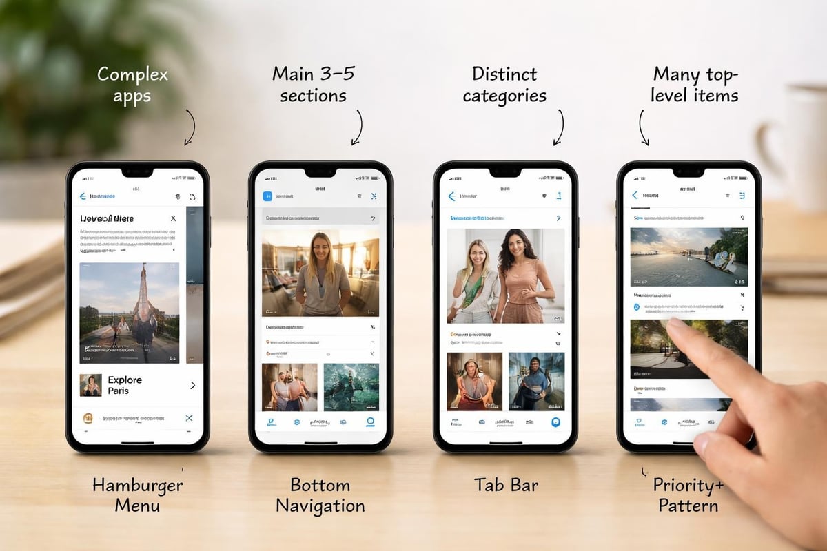
Traditional desktop navigation paradigms fail on mobile devices. Multi-level dropdown menus, expansive mega-menus, and sidebar navigation consume precious screen space whilst proving difficult to use on touchscreens.
The hamburger menu remains controversial yet ubiquitous. This three-line icon reveals a slide-out navigation drawer, conserving screen space whilst hiding complexity. Critics argue it reduces discoverability, but its widespread adoption means users understand the pattern.
Bottom navigation bars place primary actions within thumb reach. This pattern suits applications with 3-5 primary sections, each represented by an icon and label. Social media platforms popularized this approach, making it familiar to most users.
Tab bars provide visible navigation options without consuming excessive space. Unlike dropdown menus, tabs remain visible, improving discoverability. They work best for applications with clear, distinct sections.
| Navigation Pattern | Best Use Case | Drawbacks |
|---|---|---|
| Hamburger menu | Complex hierarchies | Reduced discoverability |
| Bottom navigation | 3-5 primary sections | Limited options |
| Tab bar | Clear distinct sections | Horizontal space constraints |
| Priority+ pattern | Many equal-priority items | Complexity in implementation |
Priority+ navigation displays as many items as screen width allows, hiding overflow behind a "more" menu. This pattern adapts naturally to different screen sizes whilst maximizing visible options.
Forms represent critical conversion points where poor mobile design drives users away. Each additional friction point in form completion reduces conversion rates measurably.
Mobile keyboards occupy half the screen, making lengthy forms particularly frustrating. Minimize required fields ruthlessly. Every field represents a decision point where users might abandon the process.
HTML5 input types trigger appropriate keyboards on mobile devices. Using type="email" displays a keyboard with "@" and "." keys. type="tel" shows a numeric keypad. These small optimizations significantly improve completion rates.
Form optimization techniques:
Auto-capitalization and auto-correction should be disabled for fields like usernames and passwords where precision matters. Nothing frustrates users more than fighting their keyboard whilst entering credentials.
When building an MVP Development project, form optimization often represents the difference between successful user onboarding and abandoned signups. Testing forms with real users on actual devices reveals friction points invisible during desktop development.
Mobile fragmentation creates testing challenges. Android and iOS represent fundamentally different ecosystems with distinct rendering engines, interaction patterns, and capabilities. Within each platform, countless device variations exist.
Browser testing extends beyond Chrome and Safari. Samsung Internet, Firefox, Edge, and various WebView implementations each handle mobile web design differently. What works perfectly in Chrome might break in Samsung Internet.
Real device testing provides irreplaceable insights. Emulators and simulators approximate device behaviour but miss crucial details around touch responsiveness, actual rendering, and performance on constrained hardware.
Testing priorities:
Remote testing services provide access to hundreds of device configurations without purchasing hardware. Browser DevTools offer responsive design modes simulating various screen sizes, though they cannot replicate actual device behaviour perfectly.
Consider how your application performs on older devices with limited processing power. Budget smartphones represent significant market share globally. Applications that perform beautifully on flagship devices might struggle on entry-level hardware.
Progressive Web Apps (PWAs) blur the line between mobile web design and native applications. They leverage modern web technologies to deliver app-like experiences whilst maintaining universal web accessibility.
PWAs can be installed to home screens, work offline, send push notifications, and access device features like cameras and GPS. For startups, PWAs offer a compelling alternative to developing separate native applications, as discussed in comparisons of web apps and mobile apps.
Service workers enable offline functionality by caching critical resources. Users can continue interacting with your application even without network connectivity, with changes syncing once connectivity returns.
The Web App Manifest provides metadata allowing users to install your PWA to their home screen. This installed experience launches in standalone mode without browser chrome, mimicking native applications whilst remaining fundamentally web-based.
PWA advantages:
Push notifications re-engage users even when the application is not open. Analytics consistently show push-enabled PWAs achieve higher retention rates than web-only experiences.
For entrepreneurs evaluating startup tips around technology decisions, PWAs often provide the fastest path to market whilst maintaining flexibility for future native development if needed.
Mobile web design must incorporate security from the foundation. Users access applications from public Wi-Fi networks, shared devices, and compromised connections, creating unique vulnerabilities.
HTTPS encryption represents the absolute minimum security requirement. Beyond encrypting data in transit, HTTPS enables crucial features like service workers, geolocation, and camera access. Browsers increasingly flag HTTP sites as "not secure," eroding user trust.
Authentication on mobile devices balances security with convenience. Lengthy passwords prove frustrating on touch keyboards. Consider implementing passwordless authentication, biometric options, or secure session management that does not force repeated logins.
Content Security Policy headers prevent cross-site scripting attacks by controlling which resources can load. This proves especially important for mobile applications where users might access your application from various network conditions.
Secure data storage matters for any information cached locally. Sensitive data should be encrypted at rest, not just in transit. Consider the implications of a lost or stolen device accessing cached application data.
Session timeouts protect users who leave applications open on shared or public devices. However, overly aggressive timeouts frustrate users, forcing repeated authentication. Balance security needs against user convenience based on your application's sensitivity.
Mobile web design continues evolving as device capabilities expand and user expectations rise. Success requires balancing performance, accessibility, and user experience whilst navigating technical constraints and diverse device ecosystems. Whether you are launching your first startup or iterating on an existing product, prioritizing mobile users from the beginning sets the foundation for sustainable growth. At Creator Concepts, we help founders transform their vision into production-ready MVPs optimized for mobile experiences, leveraging modern web technologies to validate ideas rapidly without compromising quality or user experience.
© 2026 CreatorConcepts Limited
128 City Road, London EC1V 2NX